The Best Interactive Website Examples We’ve Seen for Ecommerce
When it comes to eCommerce, companies can no longer afford to ignore the user experience. In fact, according to research conducted by CareerFoundry, 88% of online shoppers say they won’t return to a website if they have had a poor user experience. And with stats like that, user experience has an incredible financial impact on the eCommerce sector. So much so, failure to invest in UX design has cost eCommerce businesses over a billion dollars in potential revenue every year.
The industry is starting to pay more attention to the needs of its digital users, with an increased focus on UX and UI design. In fact, it’s estimated that just over half of eCommerce businesses conduct UX tests to make sure customers can navigate their site easily.
One of the most effective UX design elements is interactivity. By encouraging shoppers to engage with your website, they are more likely to explore your products, journey down the buying funnel, and make a purchase. Forrester reports that an interactive, well-designed user interface has been proven to increase conversion rates by up to 200%.
To provide you with design inspiration for your eCommerce site, we’ve compiled a list of the best interactive websites that have been shown to improve retention, conversion, and customer satisfaction.
The 5 best interactive website designs for improving ROI
Zwift
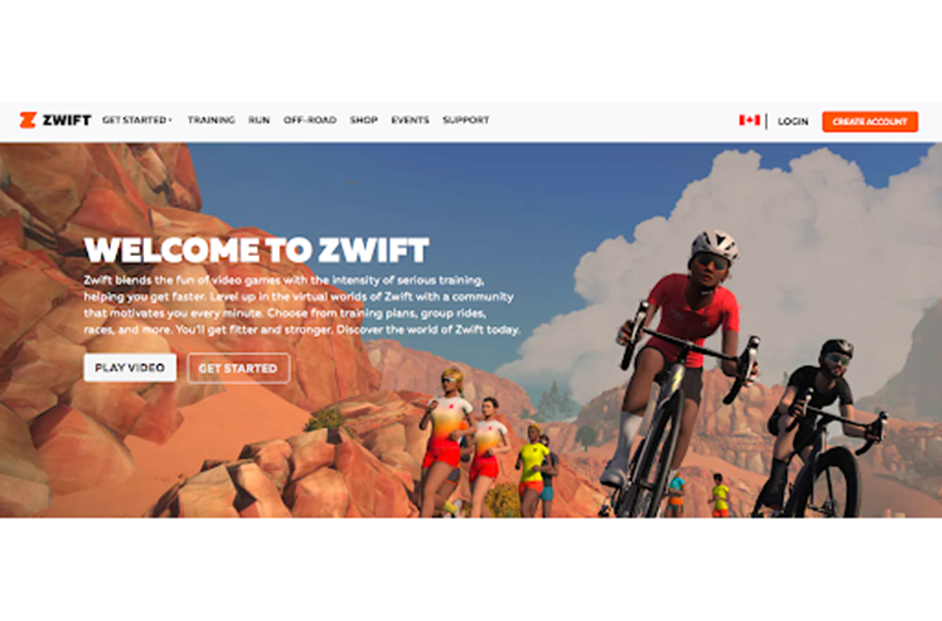
Zwift is a virtual training and workout game app. Their website is designed to make a variety of product options easy to digest. This is especially important considering 46% of online shoppers call “lack of message (i.e., they can’t tell right away what a company does)” the main reason for leaving the website.
The Zwift home page is separated by content blocks that group top features together. Shoppers are greeted by a banner video, effective copy, and two straightforward CTAs. There is even a simulation video that eliminates the guessing game by showing customers exactly what the product looks and feels like.
Apple
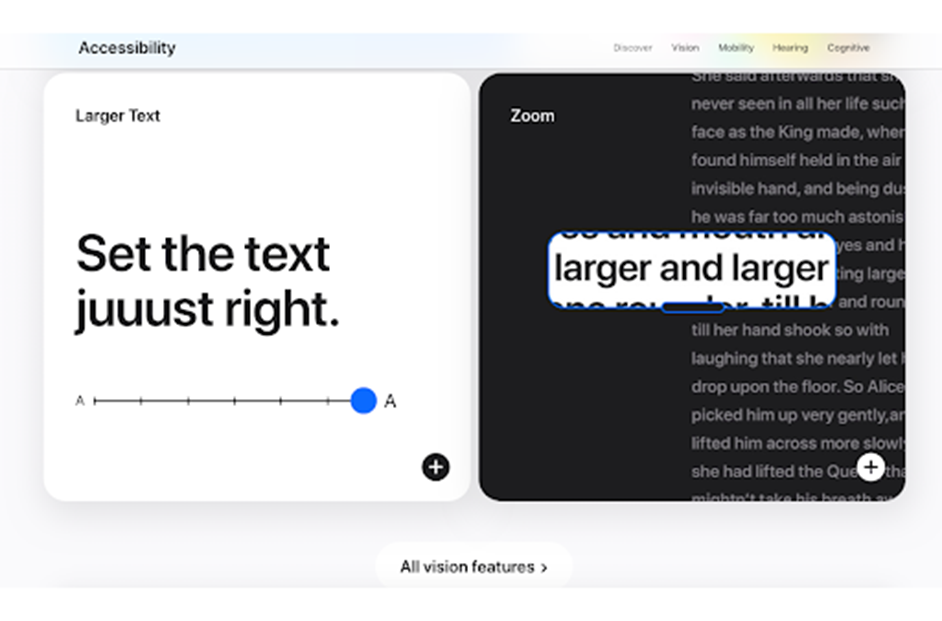
As one of the most popular brands in the world, Apple’s eCommerce website has to live up to the hype. And their website does not disappoint. They use a minimalist design to showcase the many product lines of the Apple umbrella without overwhelming the consumer. Every page is organized into distinct blocks that are clickable and easy to comprehend. For example, the Accessibility features are explained through creative visuals, interactive movement, and words. The user can then click on each box to learn more.
But most of all, Apple’s eCommerce website is fast. Speed is incredibly important to the user experience. Even one second of delay in your site speed can cause a 7% reduction in conversions. On the flip side, improving your site speed by just 0.1 seconds can increase the amount of page views by 7-8%. By building a website that is optimized for speed, Apple isn’t only improving the user experience, but they’re also inherently communicating the speed and efficiency of their own products, too.
Skullcandy
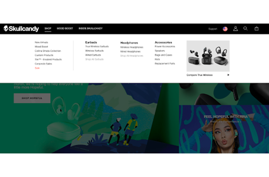
86% of consumers want more information about products and services on a company’s website. That’s why Skullcandy designed an ecommerce site that makes product exploration simple and convenient. The main navigation features a scroll over function with a dropdown list of products. Users can easily view all products and click on them without ever leaving the home page.
Skull Candy’s home page also has interactive scroll over elements. For example, when you hover over a product image, it transforms into a photo of someone wearing the product. This gives users two views of the headphones while encouraging them to engage on the website.
FitBit
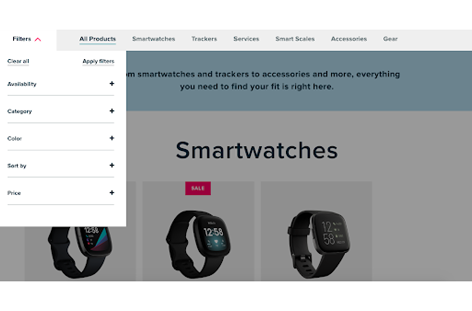
The best interactive websites will incorporate a filter function at some point in the user journey. FitBit does it right in the navigation of its products page. The webpage is organized by product type, with a dropdown filter available at any time. Consumers can shop the entire product line through a continuous scroll and customize their search by category, color, and price.
Not only is this convenient for shoppers who have specific tastes, but it also provides users with a fun way to learn about FitBit products. As results populate on the page, customers can then click, find out more, and add the item to their cart.
Draggable
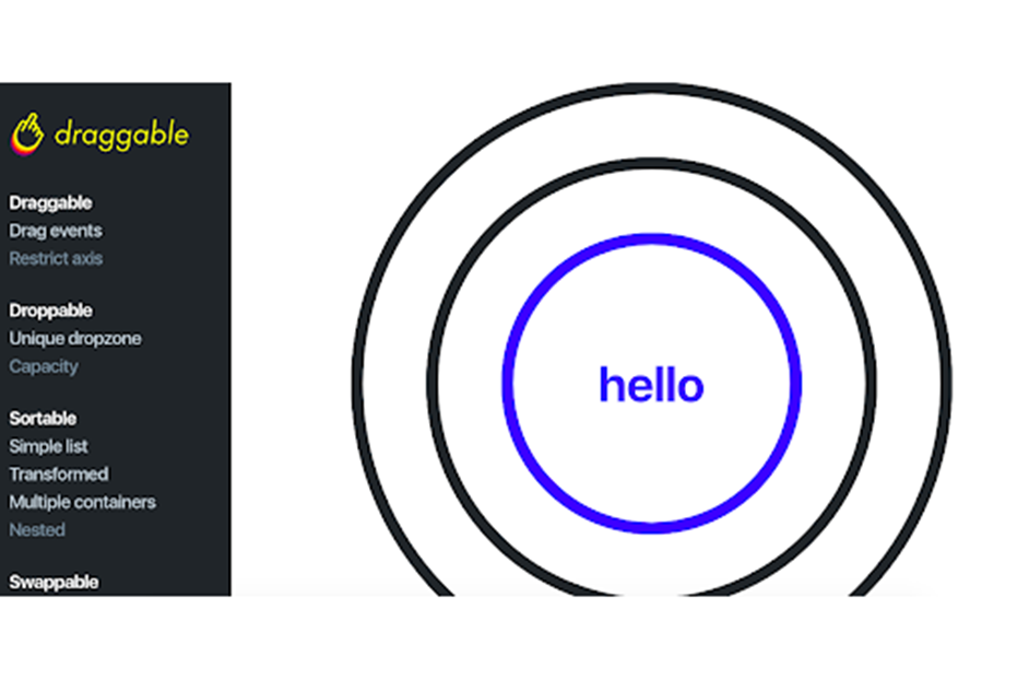
84% of consumers say that the UX of a website is as important as the actual products offered. Through Draggable’s interactive Examples section on their website, they blend high-quality UX with their product. It’s the best of both worlds.
Draggable is a modular drag and drop library for Shopify websites. Like with most digital technologies, functionality can be difficult to explain through words. That’s why Draggable created an Example tool for users to experience it themselves.
The tool uses straightforward examples of draggable, droppable, sortable, and swappable functionalities. Consumers can test drive the technology in real-time and develop an in-depth understanding of how it could apply to their business.
The best interactive websites cater to the needs of consumers
It’s estimated that every dollar spent on UX generates $100 in return, which is an ROI of 9900%, over time. Why? Because almost 80% of users say that overall site experience is the most important part of any website, especially when shopping online. By creating better interactive websites that offer a seamless and interactive UX design, your consumers will be enabled to easily explore your products, purchase, and have trust in your brand, thereby becoming loyal customers that return over and over again.
About Bread Financial®
Bread Financial® (NYSE: BFH) is a tech-forward financial services company that provides simple, personalized payment, lending and saving solutions to millions of U.S. consumers. Our payment solutions deliver growth for some of the most recognized brands in travel & entertainment, health & beauty, technology, electronics, jewelry, home and specialty apparel through our co-brand and private label credit cards and pay-over-time products providing choice and value to our shared customers. Additionally, we offer Bread Financial general purpose credit cards and saving products that empower our customers and their passions for a better life.
Bread Financial proudly marks 30 years of success in 2026. To learn more about our global associates, our performance and our sustainability progress, visit breadfinancial.com or follow us on Instagram and LinkedIn.